
Hi friends, how are you? Hanging in there? I hope so, just want to check on your “mentals” and tell you if you need to vent/talk, etc., shoot me an email- it’s good for the soul. Any way, remember when I shared this post? Well, we FINALLY finished out Master Bath remodel and I am now in love with the space. It took a little longer than expected since I was about 6.5 months pregnant and wallpapering in addition to having numerous handymen stand me up to replace the shower doors, but now that it’s all done I feel a huge weight off my shoulders! Don’t get my wrong, I love DIY, but I get super stressed when projects take forever because I HATE the mess.
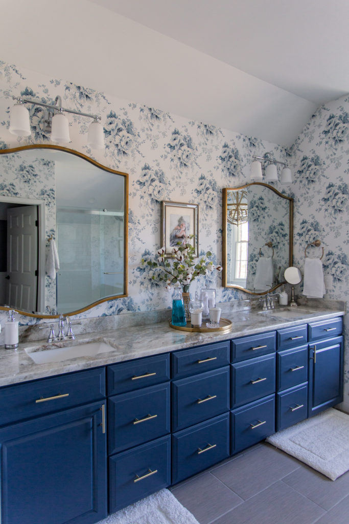
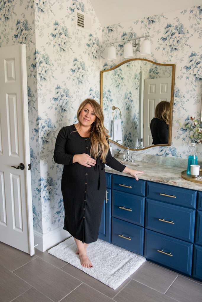
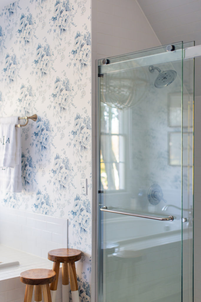
Don’t get my wrong, our master bath was fine, but it had some dated qualities that were not my favorite like glued bulky towel bars, sliding mirrors all along the vanity, track lighting and rustic fixtures that simply didn’t go with our decor. I knew I wanted the space to be light and bright and to coordinate with our bedroom which is also navy color scheme. I picked this Heritage Rose floral wallpaper from York Wallcoverings because I’ve used their papers before in our previous house and know they are great quality. Putting up the paper alone made a HUGE difference in the space since it was still the same contractor “beige” that the rest of the house was when we moved in (we’ve since made many paint changes you can see our paint colors here).
The BIG changes though came from all of the beautiful fixtures and finishes from Build.com. Y’all remember when we refreshed the kitchen with lights and a new faucet? Well, I wanted to work with them again because they’re quality and product selection is amazing. The first thing Aaron did was remove the big old mirrors in the bathroom. We had to cover the areas where medicine cabinets were (big fun, we hate drywalling, so messy). We picked these beautiful mirrors, these light fixtures and these faucets to replace the rustic style that was there. I also did a color match to the wallpaper for the vanity and changed out the hardware on it. SUCH a big difference.
Here is that space before when we first moved in:
Master Bath Remodel
Here is the tub area when we first moved in:
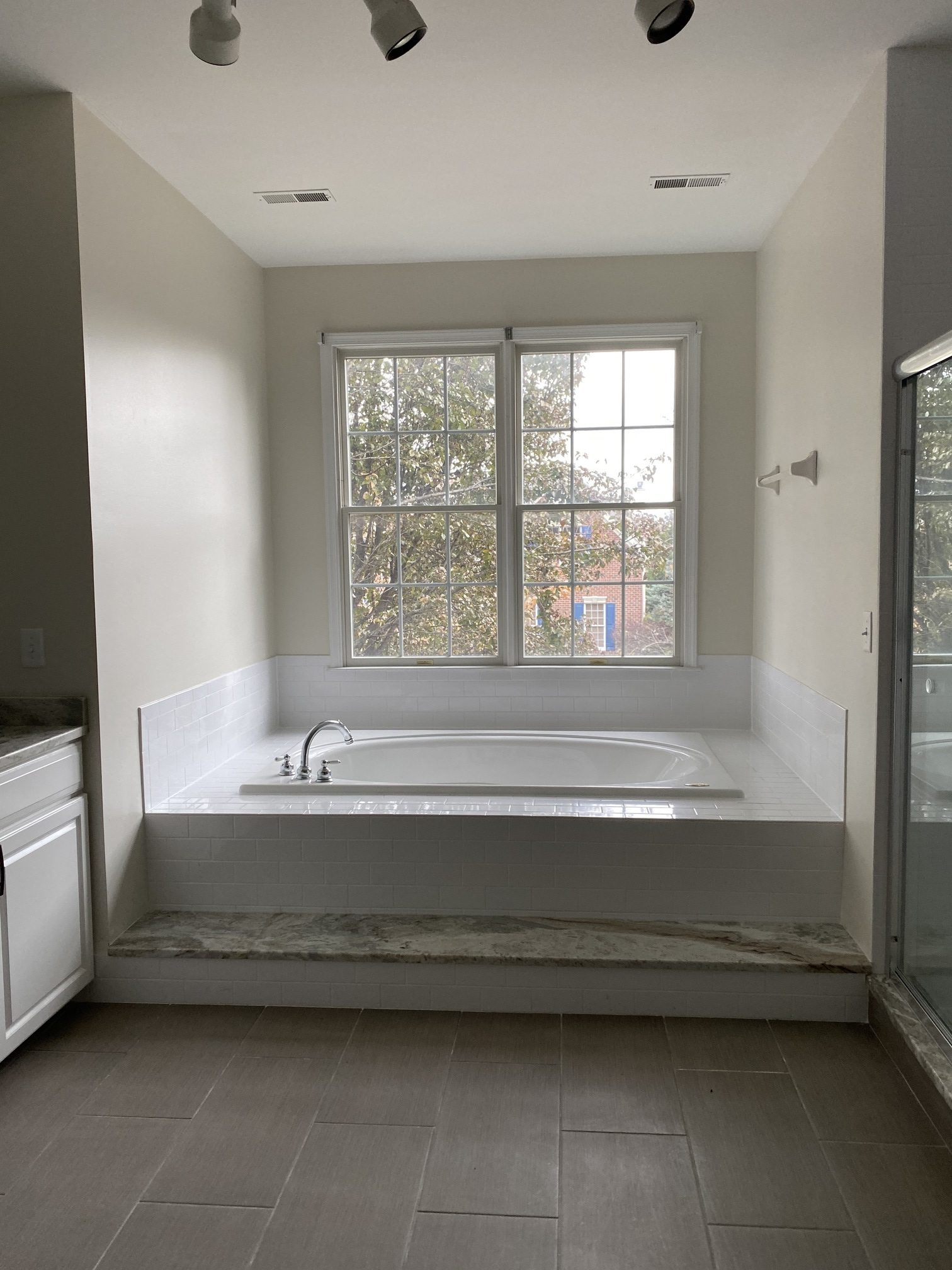
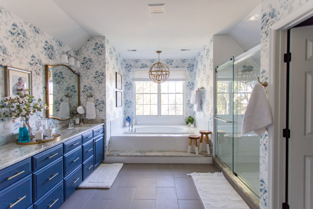
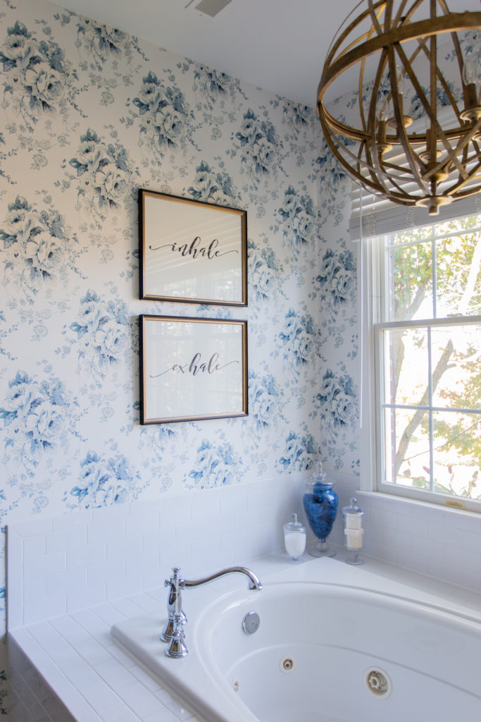
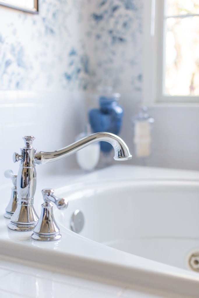
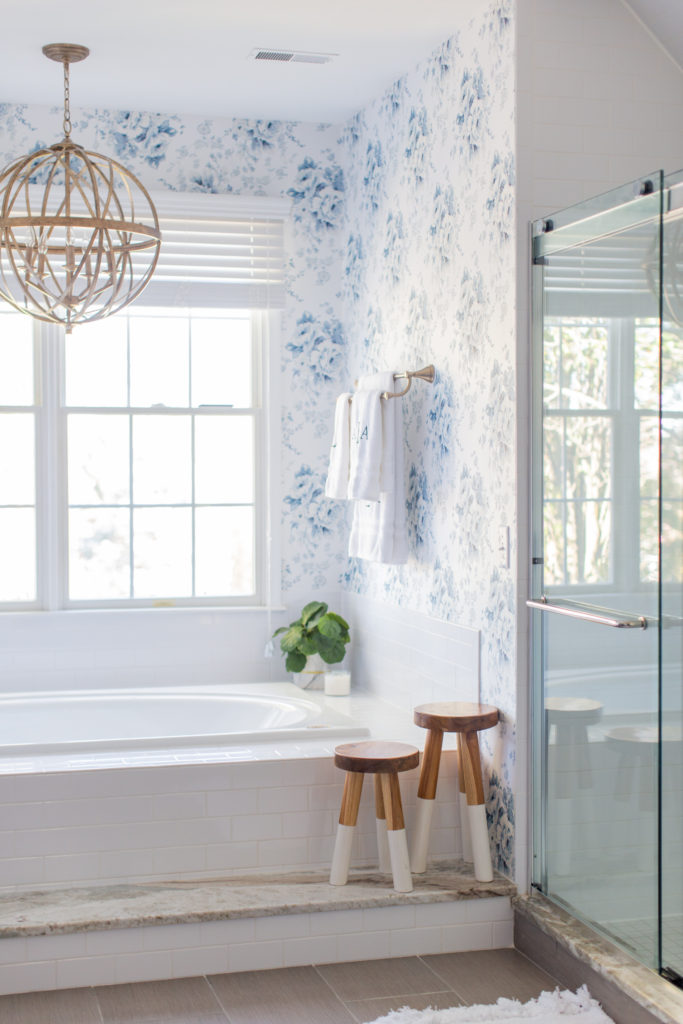
Another HUGE impact was removing the old track lighting we had, patching the ceiling and moving the fixture to over the tub. This chandelier from Build.com is stunning. We also replaced the bathtub faucet to match those of the sink. I’m not much for baths, but seeing this accent light over the tub when I walk in makes me immediately happy. And I adore these faucets. We also did the matching shower trims and I love the big heads on them which look SO much better in the space.
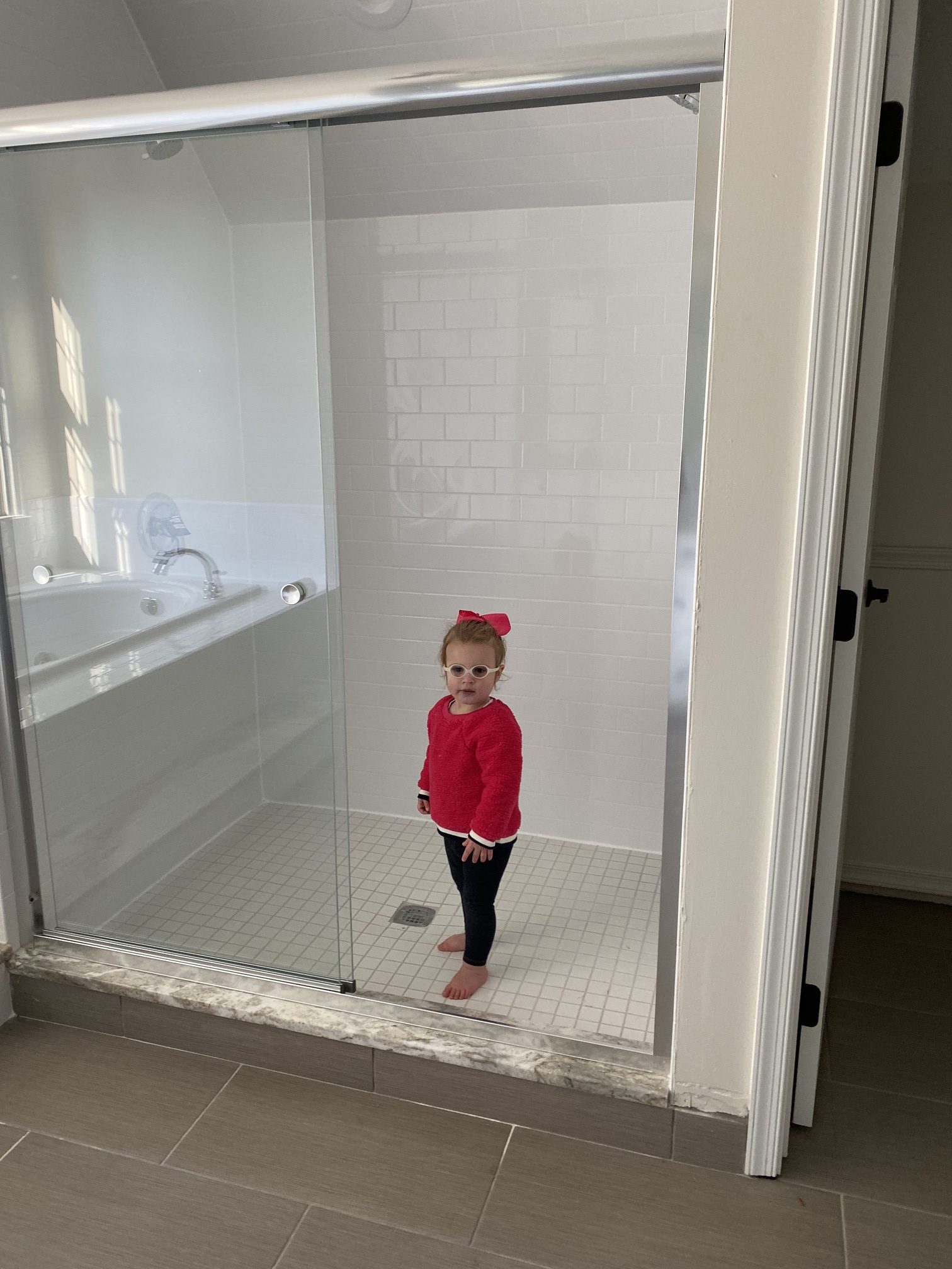
The other big transformation came in the shower doors. I know the bank had replaced ours when they listed the house, but they choose something cheap and bulky looking and while I know it’s First World Problems, I wanted something more sleek. When these FINALLY got installed by the handy man (we didn’t want to DIY them and mess up), we were both in agreement it was the right decision. These Miseno doors are so much better quality, sleek and easy to clean.
Here is what was there before:
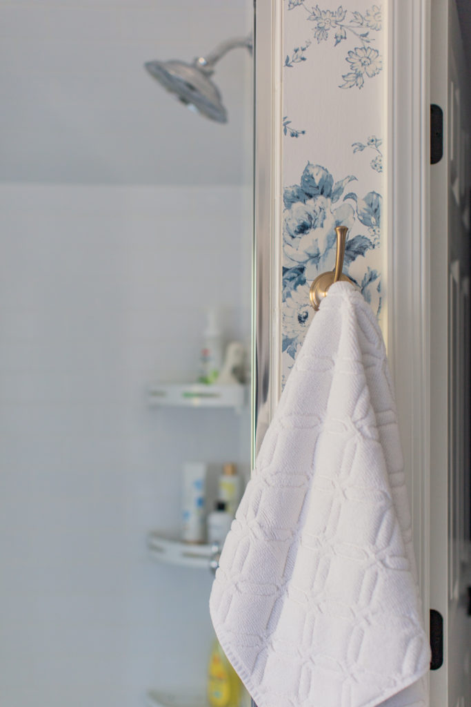
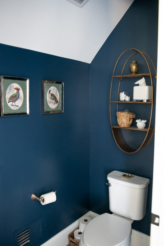
The last little area we gave an over haul to was the water closet. It’s amazing what a shelf, some paint and a new TP holder can do. I love this Cassidy line from Delta and we used it throughout. You can see I mixed and matched metals like we did in P’s bathroom. I personally love mixing metals throughout our home and am putting together a post on how to do it properly, but I get that it’s also not for everyone.
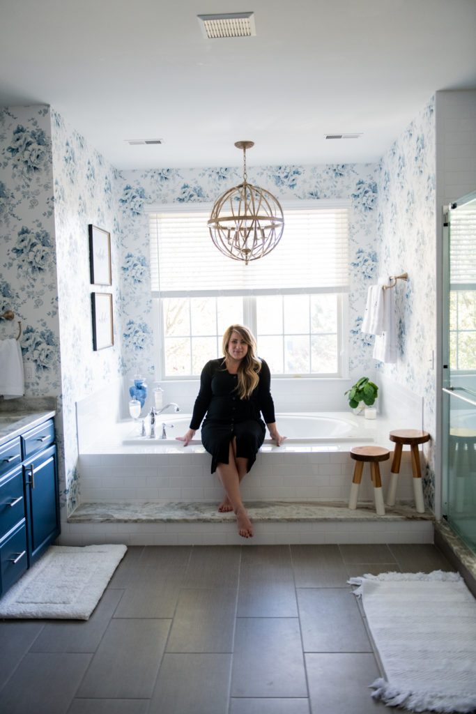
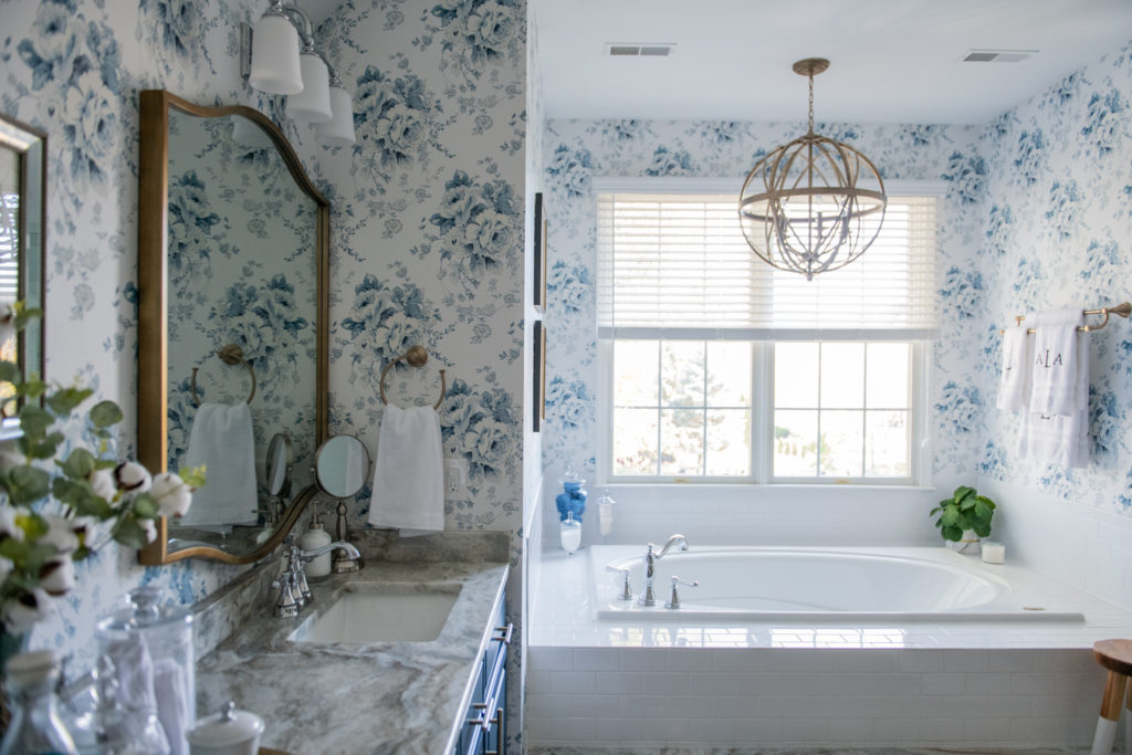
There are still things long term we need to do in here like replacing the tub completely with a free standing, adding a shade of some sort and replacing the tile and vanity granite. However, those projects are very far on the back-burner. But for now, this little facelift made a HUGE difference and goes to show that you don’t have to tear down walls or do anything MAJOR to make a total difference in your decor. It’s amazing what paint or wallpaper and new fixtures will do to a space. I feel a little giddy every-time I walk through the double doors into this space and who knows, I might become a bath person!
After all that, the fun part was just styling the space which is always my fav! All the sources are linked above and if I’m missing anything, let me know! I hope you all have a wonderful weekend gearing up for next week’s holiday (although, we’re just keeping it the three of us). I’m hoping to finish up a few small projects in the house I’m really excited about.
But first, you know the drill my friends…alll the coffeeeeee.
XX
Have you done a master bath remodel before? What did you do? Let me know in a comment below!



that turned out fantastic!! I love love love the wallpaper!!
Looks amazing! The little girl in the shower got me! Hahah I love it!
Briana
https://b-wear.org/
I just love the way your master bathroom turned out. It is so beautiful. I am so glad to see that you mix your metals. I love doing this in my home. You did a fantastic job. I love the shelf in the water closet. Where did you find that beautiful shelf?